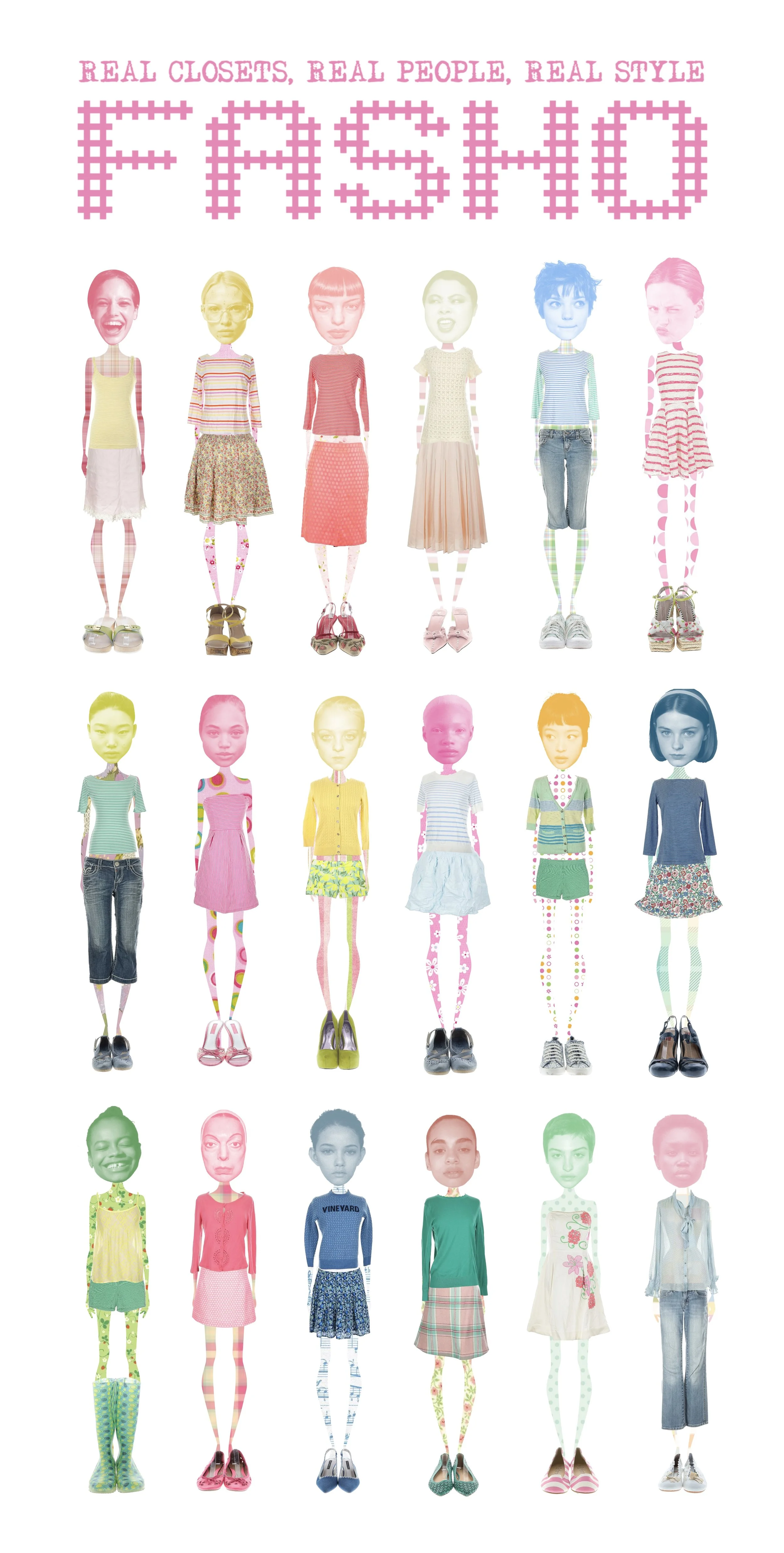
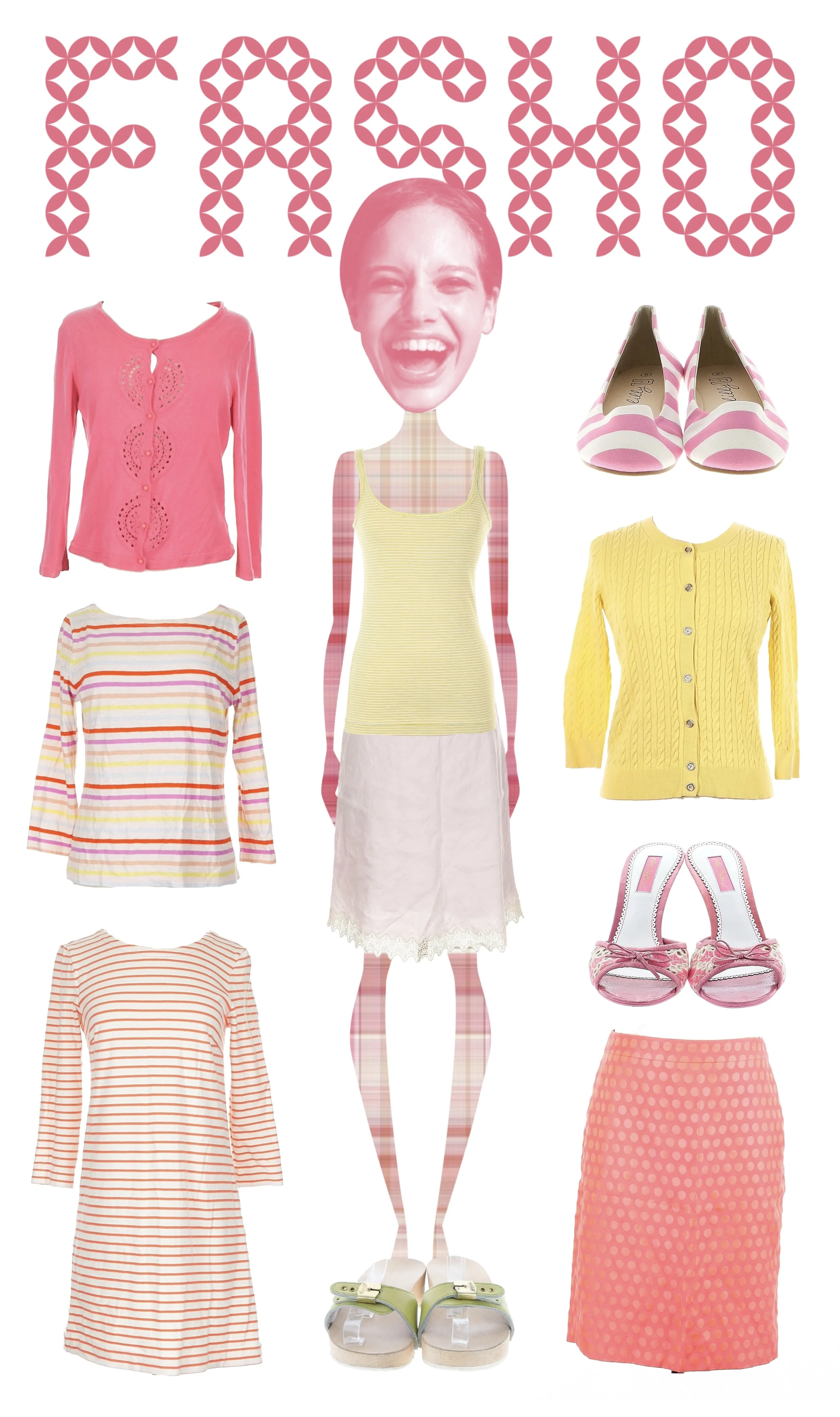
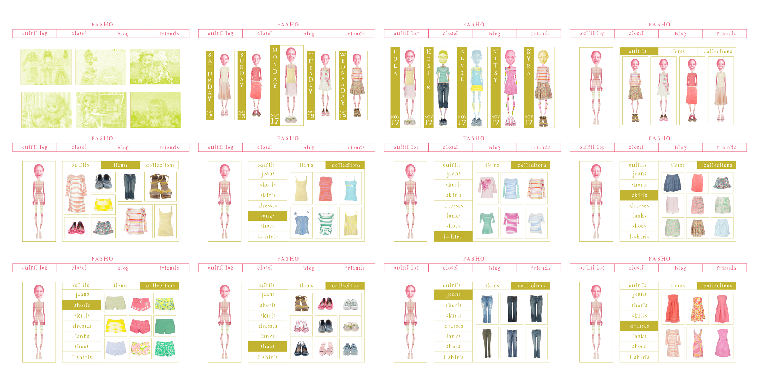
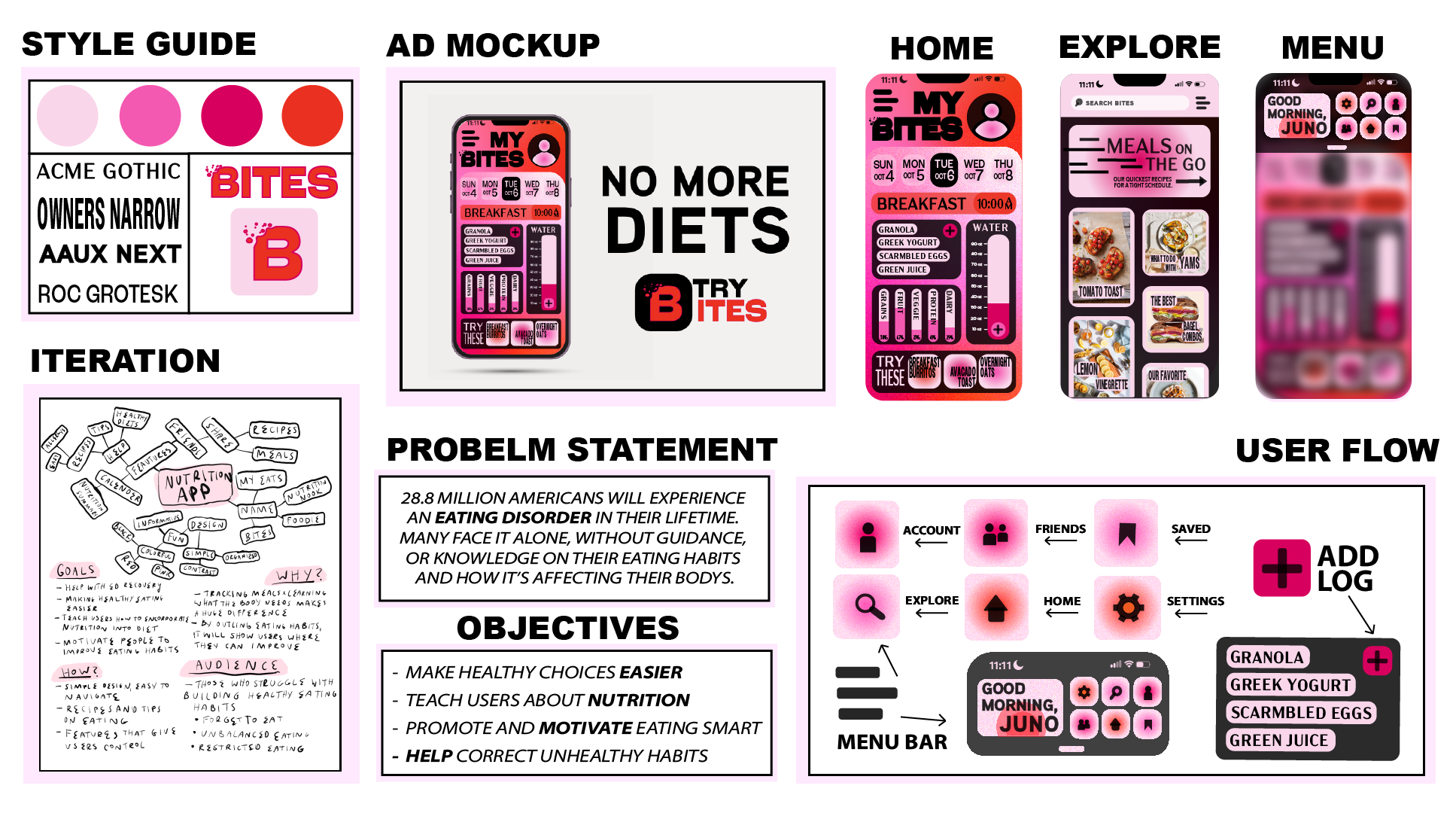
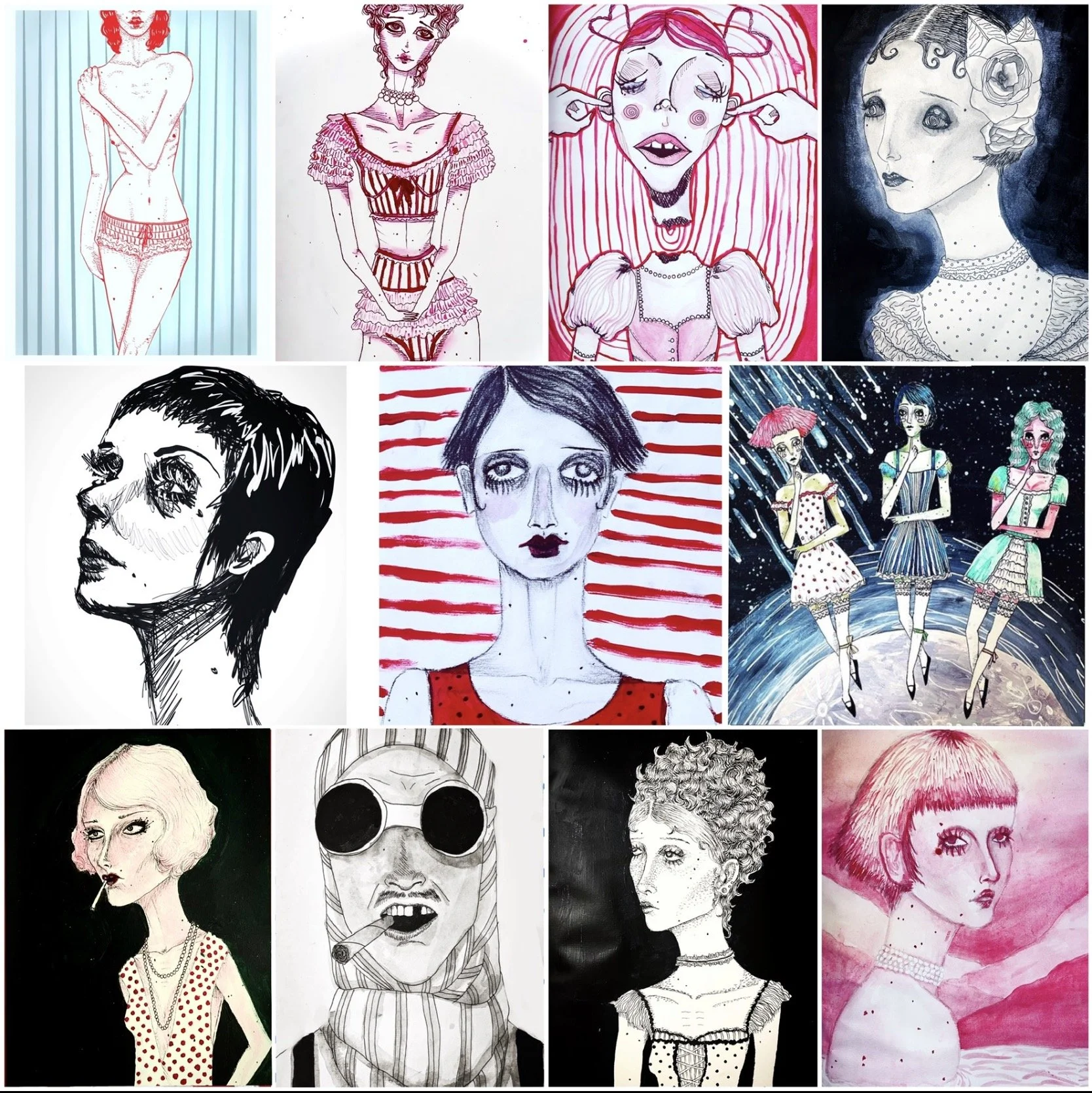
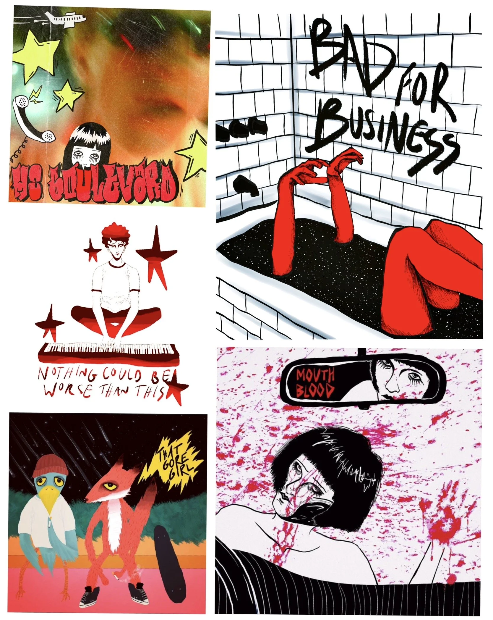
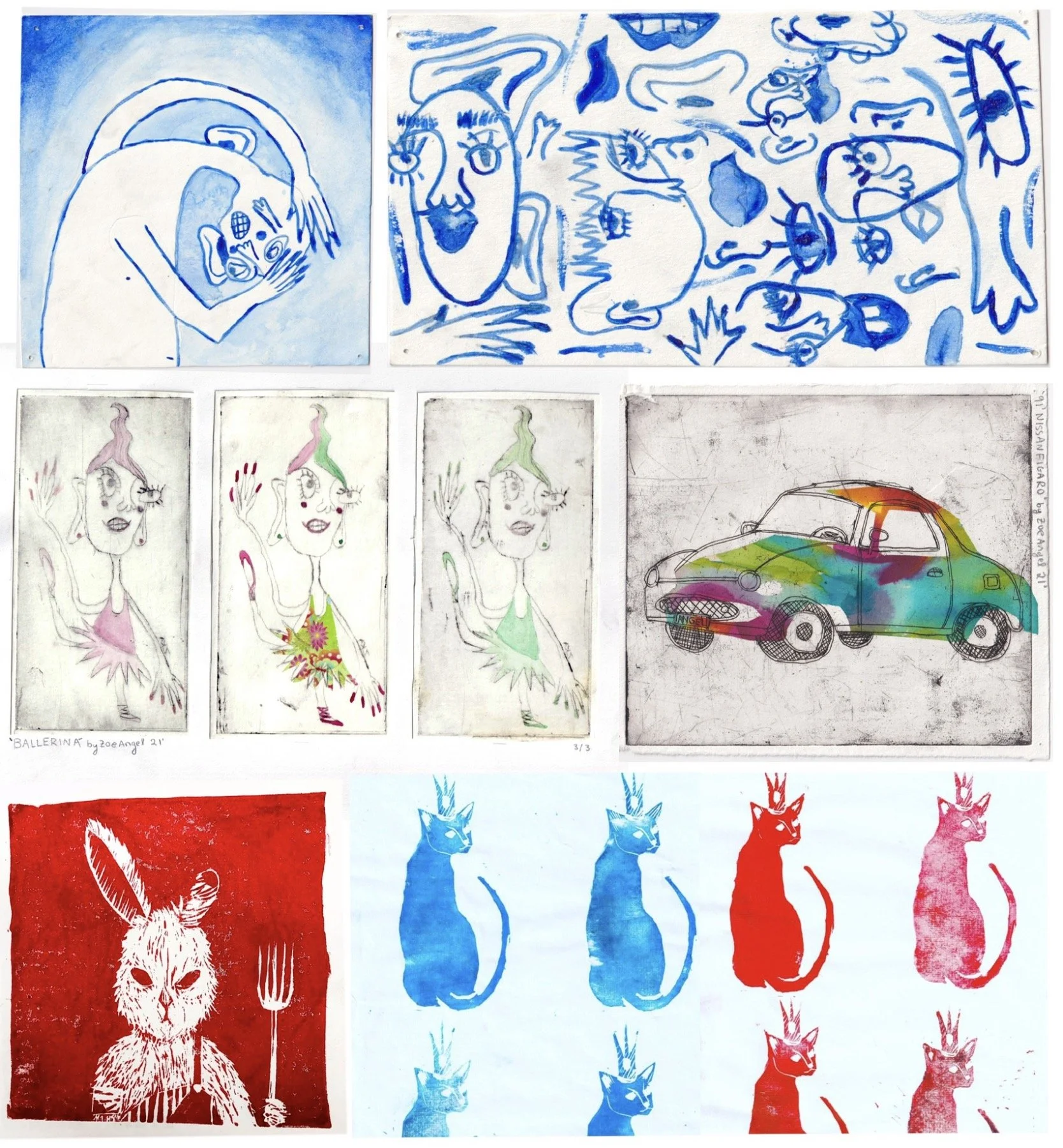
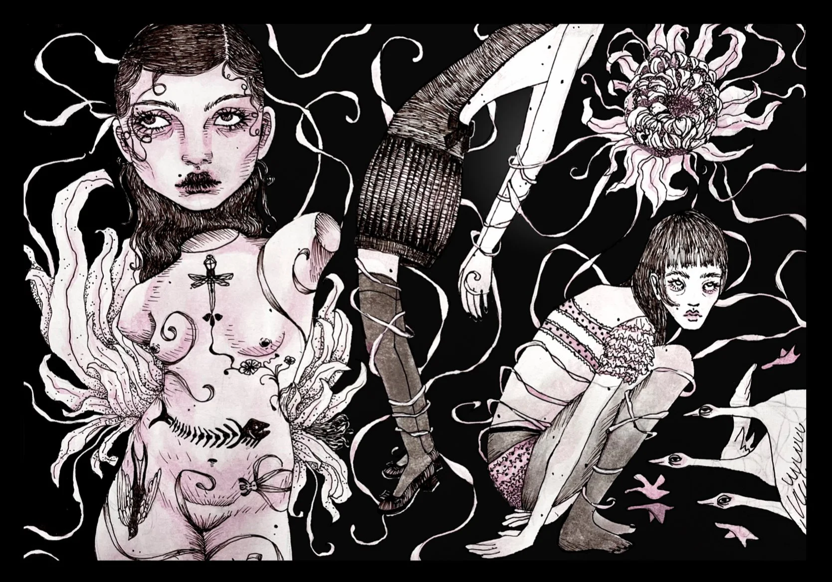
I’m Zoe Angel - a third year Communications Design major at Parsons School of Design. My work blends typography, illustration and color study in exploratory ways.
Hello!
As the final project for my Design Studio class, I designed a brand based on making a dress up game for grown ups. The idea was people could upload their clothes and create a digital closet, then log their outfits to share with friends. All of the clothing used in these designs are from secondhand websites, as I wanted the website to enforce sustainability by encouraging its users to make use of their closet and harness their own personal style rather than following trend cycles and buying from fast fashion brands. (2025)
This is a flyer thats meant to illustrate someone with a very clear sense of personal style. I wanted to show how clothes don't have to be new or trendy in order for them to be fashionable, but rather that ones style can be much more effective when it comes of as authentic expression of their character. (2025)
These are some figma frames for the design of the website itself, it also includes blog posts that allow users to learn more about things like layering, curating and materials. (2025)
Fasho "headquarters" is an experiential design, I wanted to apply the brand identity to a physical space as well as figure out how their philosophy can be enforced through experiences. So inside the space would be clothing swaps, sewing classes, tailors, and creative spaces that encourage people to express their style through illustration, photography and collage. (2025)
Bushwick Archeology began as a series of photos I took of the doors around my neighborhood in Bushwick. They serve as documentation of every era that neighborhood has gone through. The material within the book discusses Bushwick's history, Door's history, and how its each community it's been home to has expressed themselves through these doors. (2025)
The final project for my Typography class was to make a book out of a wikipedia page. I was reading 1984 at the time and was inspired by all the different cover designs for Orwell's books. (2024)
These posters were for a Typography project using songs, we were limited to 5 fonts (I chose Activ Grotesk), no color, and no imagery. Clementine by Elliot Smith tells of a man drinking away his problems at a bar, singing of lost love. The first posters draws off the mural that famously appears within his Album Cover, one that uses lines to create a sense of motion. The second uses typography to create forms, Clementine comes in the shape of a beer bottles, the text shifts from black to white to imitate the bottle slowly emptying. (2024)
UTEC is a Boston based nonprofit with a series of social enterprises aimed to help youth in poverty. During my internship with CTP, I worked with the creative team to design a series of logos for their social enterprises to help tie them into the UTEC brand. This is my final design which they ended up choosing. (2025)
Girlhood Illustrated is a hypothetical museum exhibition for children's picture books that demonstrate girlhood. I was inspired by childhood favorites like Eloise, Olivia, Pinkalicious and Fancy Nancy, all of which push young girls to be authentic to themselves. I found inspiration in my childhood closet, which was full of florals, polkadots, stripes and plaids, and had a very distinct spring color palette. The typeface for "girlhood" is hand drawn, deriving from block letters and children's book covers. (2025)
This is an app design made for those who have been affected by diet culture. Its goal is to focus on nutrition, rather than calorie counting, helping anyone who struggles to regulate eating habits. (2023)
This candle design was done with procreate, I designed a couple iterations of a candle label and created a mockup image using photoshop. (2023)
Designed for a t-shirt as merchandise for musician Mike Dough. Done using procreate, and taking inspiration from 90s comic books/pop art. (2023)
Before graphic design, I siphoned most of my creativity into illustrations. Through this I was able to curate my creative voice and find my style. (Left to right) - Digital drawing (Fall 23) - Ink and water color (Fall 22) - Ink and water color (Spring 22) - Ink and acrylic pant (Fall 22) - Colored pencil (Summer 23) - Acrylic paint (Winter 21) - Digital drawing (Winter 23) - Charcoal and acrylic pant (Summer 23) - Ink and Watercolor paper cutout figures on acrylic paint background (Spring 22) - Digital drawing (Summer 22) - Charcoal drawing 17X24 (Fall 22) - Ink and watercolor subject, acrylic paint background (Summer 22) - Ink and acrylic paint (Fall 22) - Ink subject, acrylic background (Fall 22) - Watercolor (Fall 22)
Many of my friends are musicians, so I was often commissioned to design album covers and promotional material to help build their brand. All done on Procreate (Left to right) - Ms Boulevard, a single by band Somebody Somewhere, using a still from music video, and doodles relating to the songs story (Fall 23) - Bad For Business, a music duo, express hardships through music, this composition intends to reflect that (Winter 23) - T-Shirt design for solo musician (Winter 23) - Mouth Blood, a hardcore band, requested a particularly gory album cover (Winter 23) - Gore girl album cover, the artist’s vision was cartoonish fox and bird smoking on a curb (Spring 23)
Medium Explorations (Top to bottom) Row 1: Watercolor medium, left: a jumbled man, right: blind drawing (Summer 21) Row 2: Intaglio prints, with paper and watercolor details, left: some funky ballerinas, right: a 91’ Nissan Figaro (Summer 21) Row 3: Lino cut prints, left: Angry Peter Rabbit, right: A royal cat
This was a scrapped iteration for a Fasho poster. I wanted to do something that combined photography and illustration. the idea was to have it verge on off putting, something that could catch passerbyer's eyes and encourage people to embrace weirdness and authenticity. (2025)
This 17x24 Collage was made using a series of printed images, based off the excerpts written within. (2022)
This is a dreamscape made using a series of photographs I had taken, made using procreate. (2023)
This began as figure drawing practice, but throughout the process I began to see a story emerge. In this piece I tried to illustrate personal evolution, with each woman exploring a different version. I had recently wrote an essay on growing up, focusing on brain development and how I feel like a completely different person than whoever I was a few years ago. Despite this, my memories shape me, they hold me to who I was and who I will be, the string is meant to represent that connection. (Fall 23)
Revisiting a concept that I had sketched out years before, this piece became a visualization of the anpothrocene era, with powerful industry’s as the hand who poisoing earth with cigarette smoke. The smoke represents money and it’s short lived satisfaction taken over the lives of future generations. The woman represents the majority, who see this damage, but are seemingly unable to interfere. She is based off a Greek statue, pushing the narrative of her inability to take action. I took inspiration for early 1900s advertisements, using pencil for the subject and acrylic paint for the background. (2023)
A variety of illustrations connected through crawling vines, and blossoming petals. It began a brainstorm for a perfume advertisement, but became it's own piece when connected through the vines. Ink and watercolor subjects, acrylic paint background.(2023)
1/3 Read To A Child is a nonprofit that hosts a fundraising gala each year. CTP was tasked with designing the promotional materials for this years gala, based on the theme of an Enchanted Forest. These are some of the final pieces I designed in collaboration with the creative team during my internship. (2025)
2/3 Read To A Child
3/3 Read To A Child
1/4 Young Shits Advertising Club holds contests for young designers with a different prompt every month. July's prompt was to help expand Swiss Miss into summer. When researching the brand I discovered their old advertisements from the 60s, and found inspiration in the Swiss Miss girl and packaging design. I based this proposed campaign on a collaboration with drag queen Trixie Mattel, who's image is distinctly pink and retro. I came up with a fruit-ified Swiss Miss mix, and designed the packaging to remix the original 60s design with a Trixie inspired color palette. (2025)
2/4 Swiss Miss x Trixie Mattel
3/4 Swiss Miss x Trixie Mattel
4/4 Swiss Miss x Trixie Mattel